 Book Free Consultation

Salesforce Omnistudio Flexcards
Understand how FlexCards enable the creation of dynamic, data-driven UI components in Salesforce with ease.
By Pradeepa Singaravelan
Associate Salesforce Developer
FlexCards in Salesforce OmniStudio
Introduction
A FlexCard in Salesforce OmniStudio is a user interface component that displays information in a structured and interactive way. It helps users quickly view important details and take actions like opening records, starting workflows, or calling APIs. FlexCards retrieve data from different sources, such as DataRaptor, Integration Procedures, and Apex, and can be customized to show or hide certain elements based on conditions. FlexCards are commonly used in customer service dashboards, account summaries, and product catalogs. Because they are easy to configure and reuse, they can be placed in Lightning pages, Communities, and other Salesforce applications to improve efficiency and user experience.
Difference between FlexCard and OmniScript
| Flex Card | Omni Script | |
| Purpose | Displays data visually | Guides users through a process |
| User Interaction | Mostly read-only with limited actions | High interactivity with inputs & decisions |
| Data Handling | Fetches & displays data | Reads, writes, and updates data |
| Logic & Flow | Limited logic (visibility rules) | Supports branching, conditions, & decision-making |
| Best Use Case | Dashboards, summaries, quick data views | Multi-step wizards, data entry, and complex workflows |
FlexCard Workflow
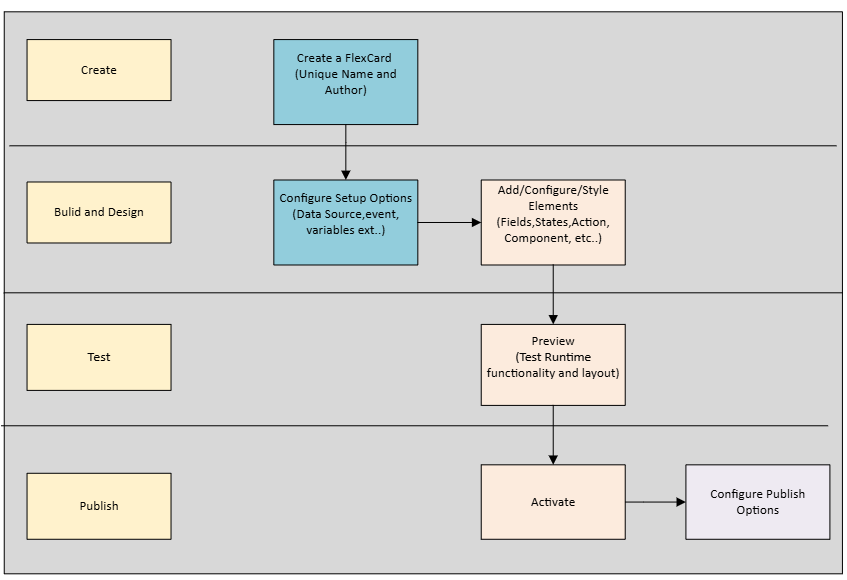
FlexCard Designer
FlexCard Designer lets you quickly configure, preview, and debug cards. You can do all sorts of awesome things like drag and drop, position, and resize user interface (UI) elements onto a canvas to format text, buttons, icons, images, links, charts, tables, and even other FlexCards.
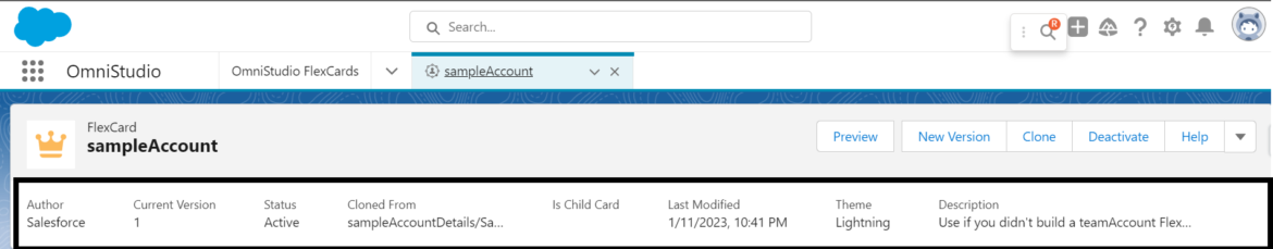
Header and Canvas
The header is where you view metadata and perform actions related to your FlexCard, such as the following,
View basic metadata about your FlexCard, such as Author, Version, Status, the FlexCard it has been Cloned From, whether it is a Child Card, Last Modified date, and Theme.
Toggle between Design view and Preview, create a new version of your FlexCard, and clone, activate, or deactivate your FlexCard.
Configure Publish Options for an activated FlexCard, and export your FlexCard. Access FlexCard documentation via the Help link.
Drag elements such as fields, actions, images, states, child FlexCards, and custom Lightning web components (LWC) from the Build panel onto the canvas.
Rearrange, clone, delete, and adjust the widths of your elements as needed.
In Design view, test the responsiveness of your FlexCard with the viewport dropdown.
This feature allows you to see how elements are positioned at different viewport breakpoints.
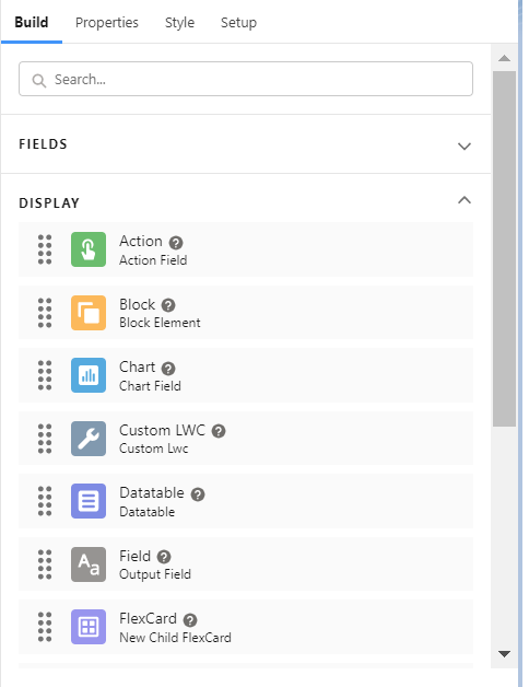
Build, Properties, Style, and Setup Panels
To build your FlexCard, drag fields and elements onto the canvas.
Fields
Drag fields based on the FlexCard’s configured data source onto the canvas.
Display
Add simple elements to your FlexCard such as text, images, icons, and blocks.
Add more complex elements such as actions, charts, menus, and data tables.
Add states to your FlexCard, embed custom Lightning web components, and embed reusable child FlexCards.
Flex Cards Actions
Action Type Name | Description |
| Card | Perform card level action, such as update data sources, set values, remove, and select cards. |
| Custom Event | Fire a Custom Event to notify the parent flex card of an event occurring. |
| Data | Tigger a data source from an action to get data from a server or post data to a server |
| Flyout | Display additional information from a Child Card, OmniScript LWC in a window or Popover. |
| Navigate | Add actions directly on a card by selecting a target URL or a Page Reference type that enable navigation within Lightning Experience, within Communities, or to an external web address. |
| Omniscript | Launch an OmniScript from a FlexCard. |
| PubSub Event | Fire a PubSub Event to Notify another Component on a page or application of an event occurring. |
| Update OmniScript | Update an OmniScript from a FlexCard embedded as a custom LWC in an OmniScript. |
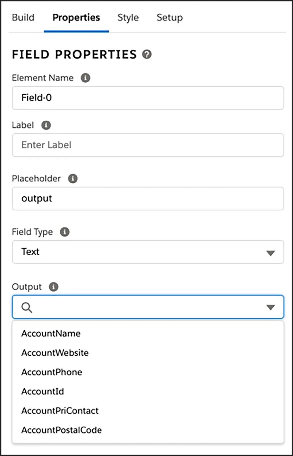
Properties Panel:
When you select an element on the canvas, configure the element’s properties from the Properties panel to determine how the element behaves.
For example, when you select a Field element, update the label, choose the data field value to display, and select the field type.
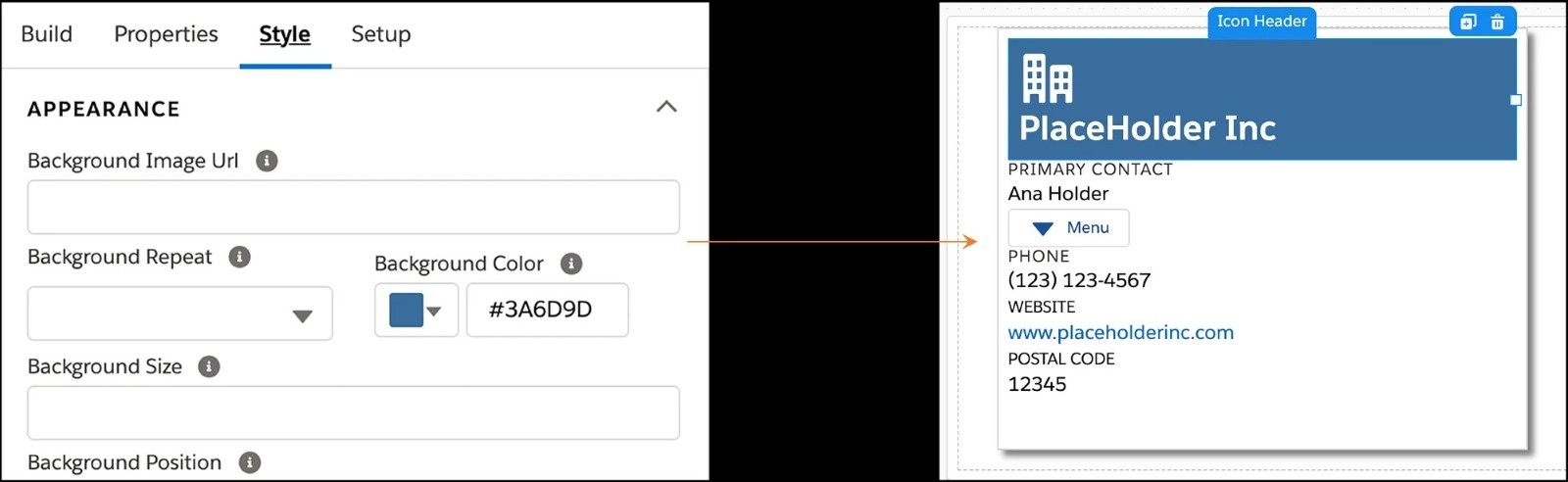
Style Panel
Use the Style panel to style your FlexCard elements and update their appearance in real time. This panel has settings for configuring backgrounds, sizes, borders, padding, margins, height, fonts, and responsiveness.
When you create a style for an element, save it for use on multiple elements on the FlexCard.For custom designs, create and apply custom CSS.
Setup Panel
You configure multiple settings when you create a FlexCard using the data source. For existing FlexCards, go to the Setup panel to update these settings or configure more settings.
Update your Data Source.
Apply custom permissions to limit access to your FlexCard.
Track Custom Data on elements with tracking enabled.
Enable Multi-Language Support, set Session Variables, and create Event Listeners.
Using FlexCard to Display Contact Data
A FlexCard in OmniStudio can be used to display Contact Data in a structured and interactive format. Here’s how you can set it up:
Click the App Launcher, Select the OmniStudio Application.
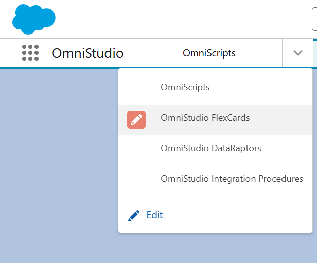
Click the flex card in Omni studio App.
Click New to create a new FlexCard.
Enter the Name for FlexCard.
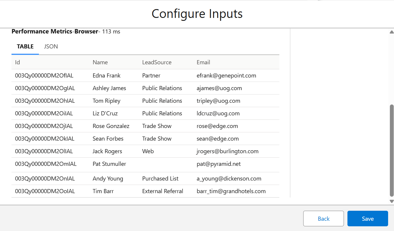
To display the data in a table, select the data type.
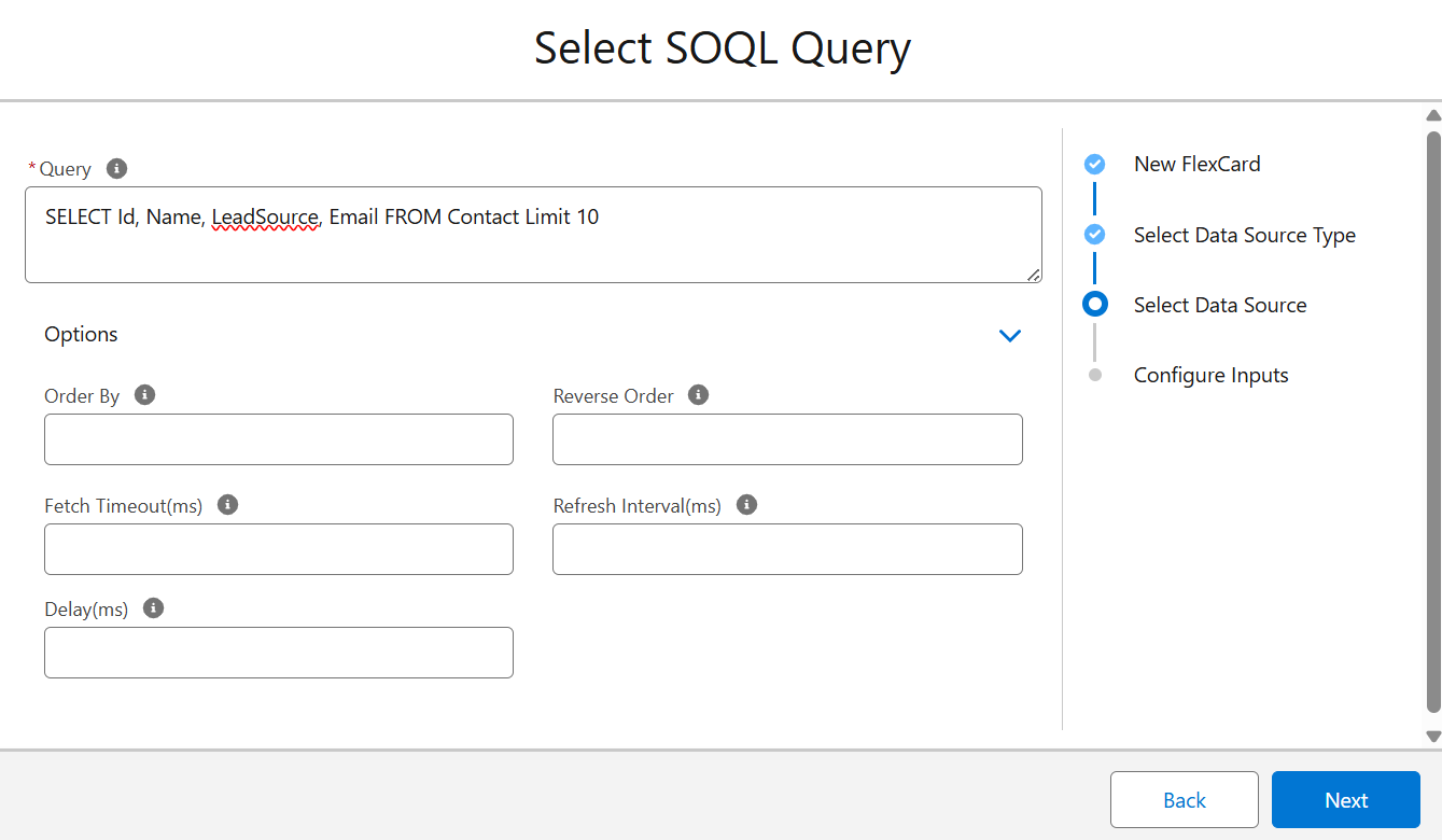
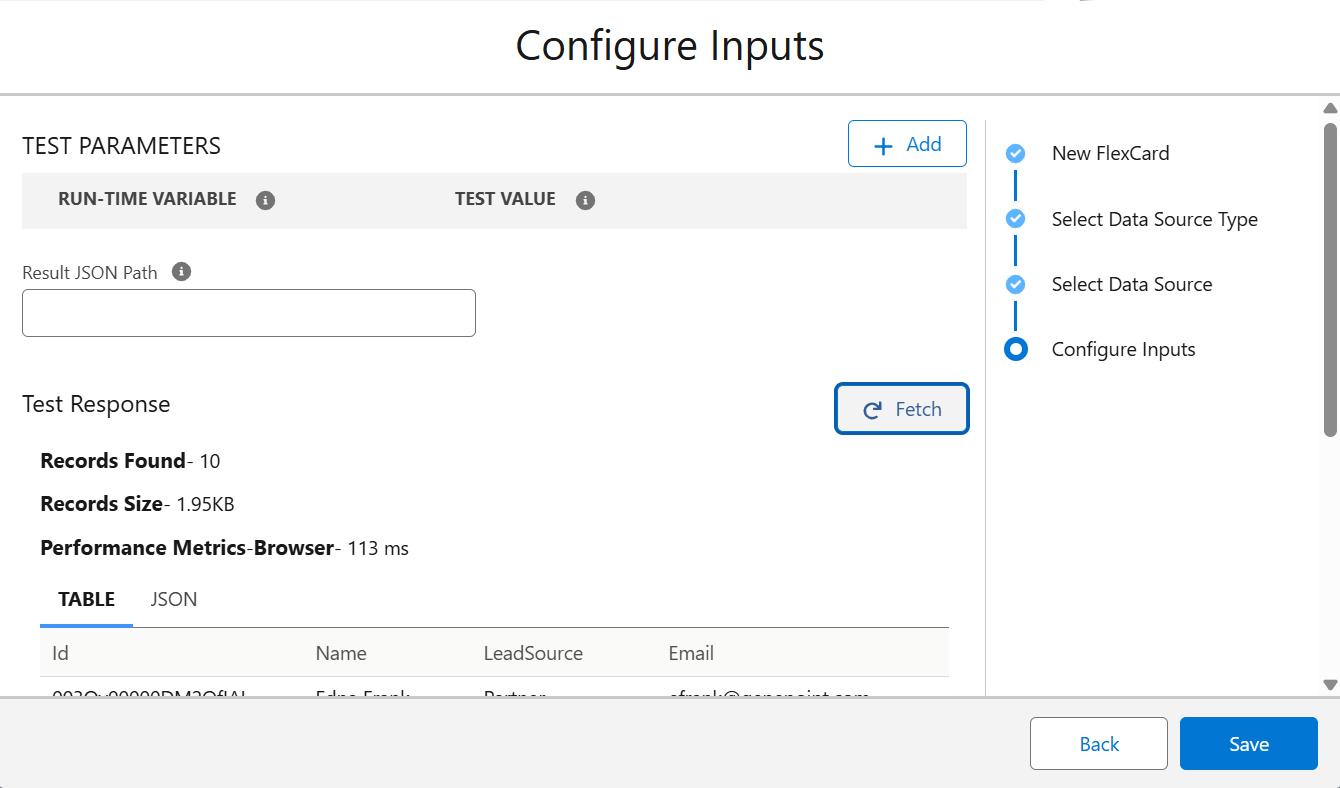
Use the Configure Inputs Window to retrieve the sample data and verify it. After clicking the save button.
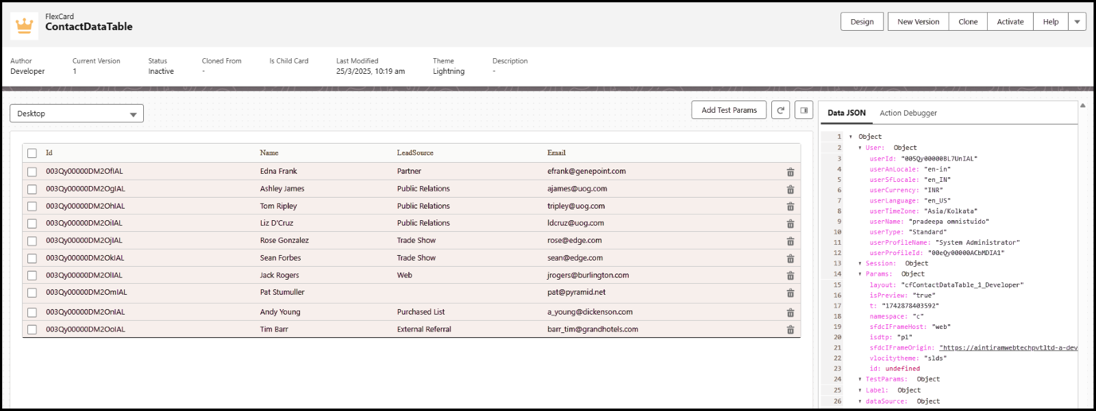
Add a Data Table to Display Contacts In the Build Panel, drag the Datatable component onto the Canvas.
Click on the Datatable to open the Properties Panel.
Configure the data table:
Data Source → Map it to the list of Contact records.
Columns → Select the fields to display: Id, Name, LeadSource, Email
Customize the Table Style, Open the Style Panel to modify:
Table Header Font, Size, and Color.
Add the Background color
Column Width Adjustments
- Click the Preview button. After activating the Flex card component, verify the user interface.
Insert the Flex card where you need to add a component to your organization, such as the Home page, App page, or Record page.
Conclusion
Flex Cards simplify data display in Salesforce Omni Studio, making information easy to access and interact with. They are customizable, support multiple data sources, and enhance user experience by improving efficiency in dashboards and workflows.